victor borg portfolio
senior-lead ux/ui & product designer with a love for crafting digital experiences
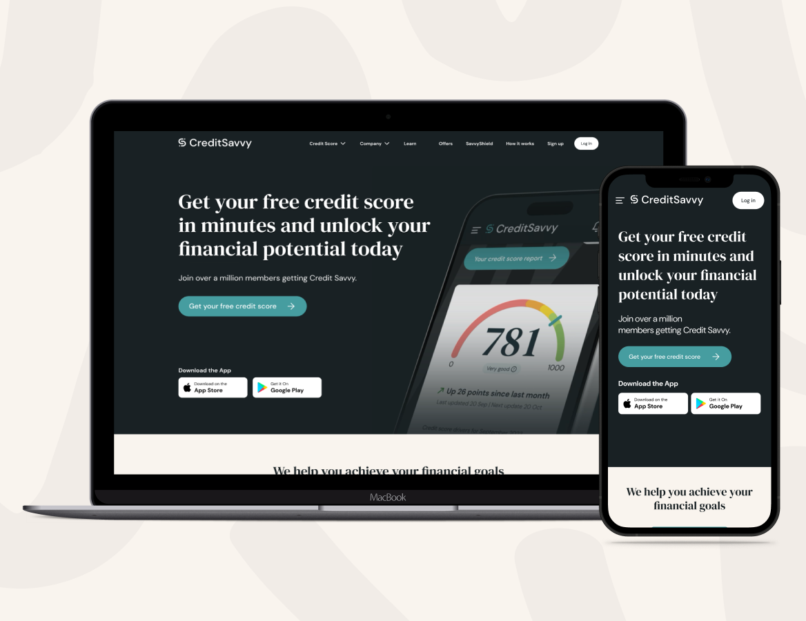
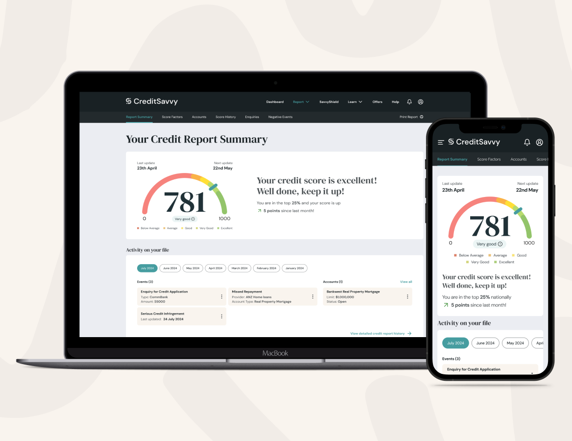

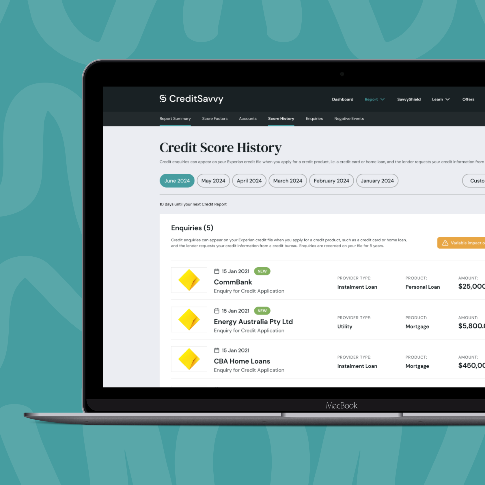
responsive web
adaptive layouts at 375, 1024 & 1400 for seamless comparison, signup, and dashboard flows
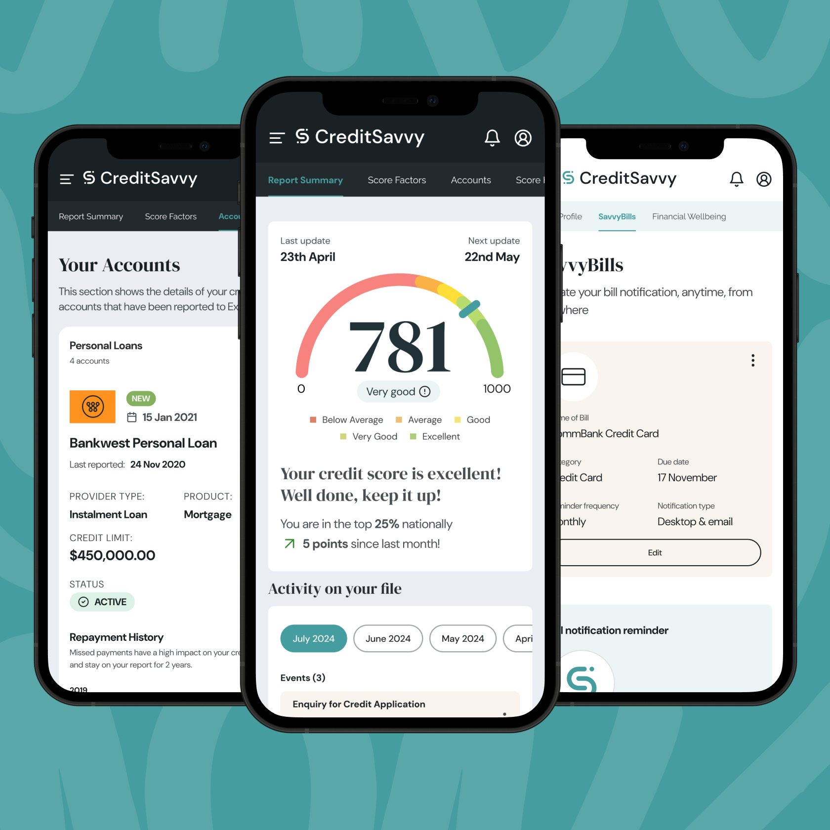
mobile templates
high-fidelity iOS & Android mockups for credit reports, goals & referrals
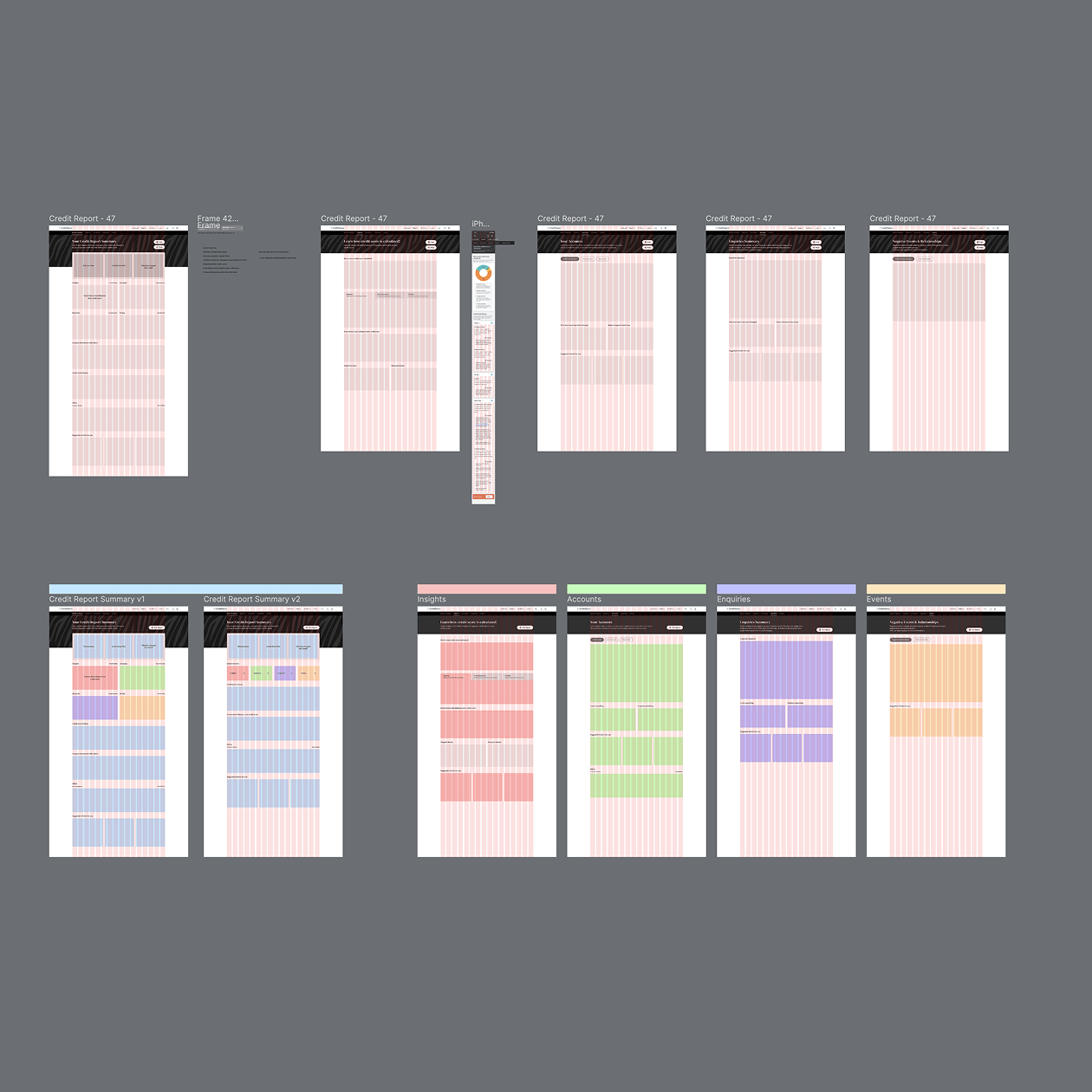
component library
figma library of buttons, cards, tables, forms & modals with variants & auto-layout
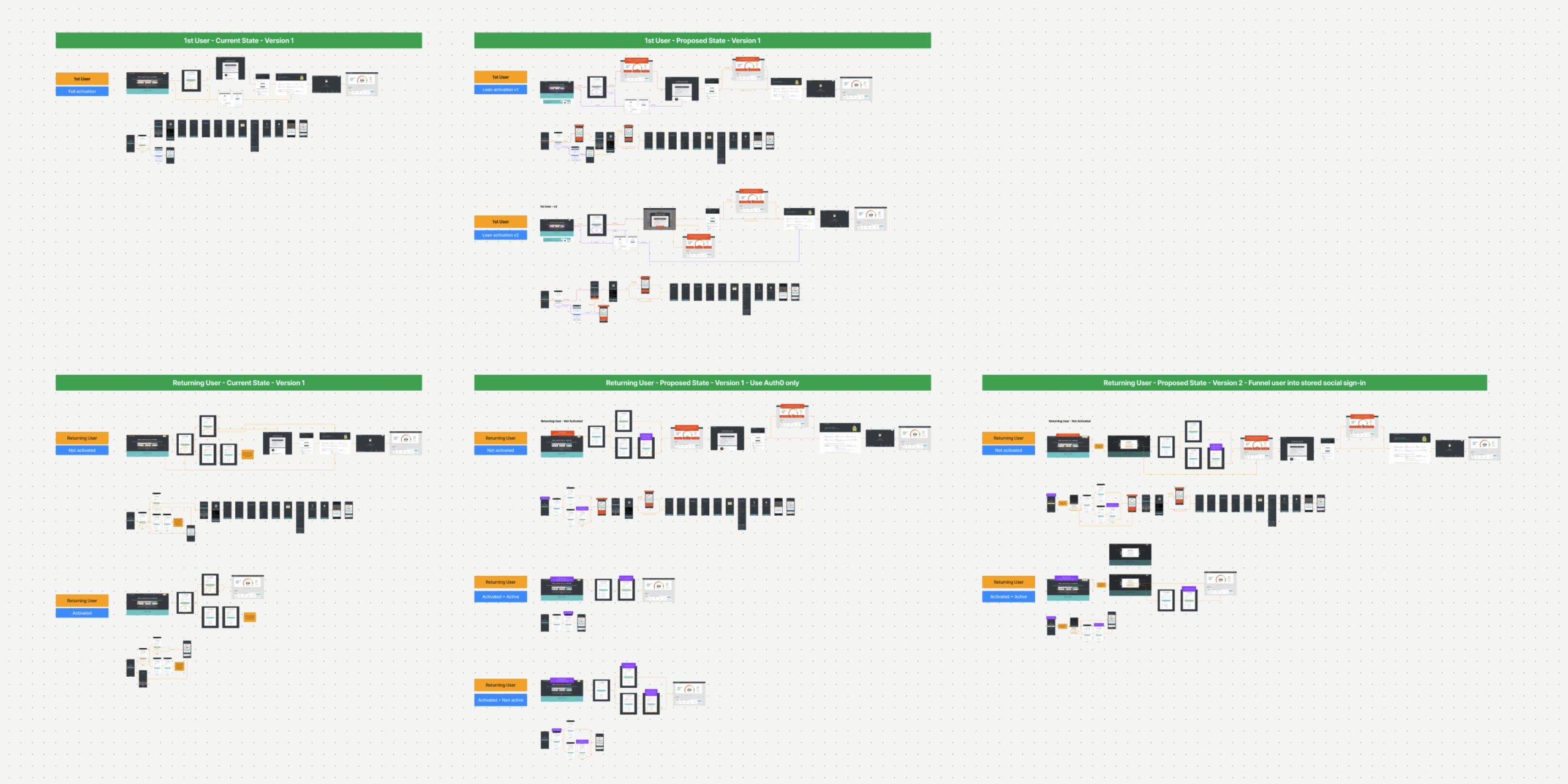
figma prototypes
clickable flows with smart-animate transitions for tables, expandable rows & validation
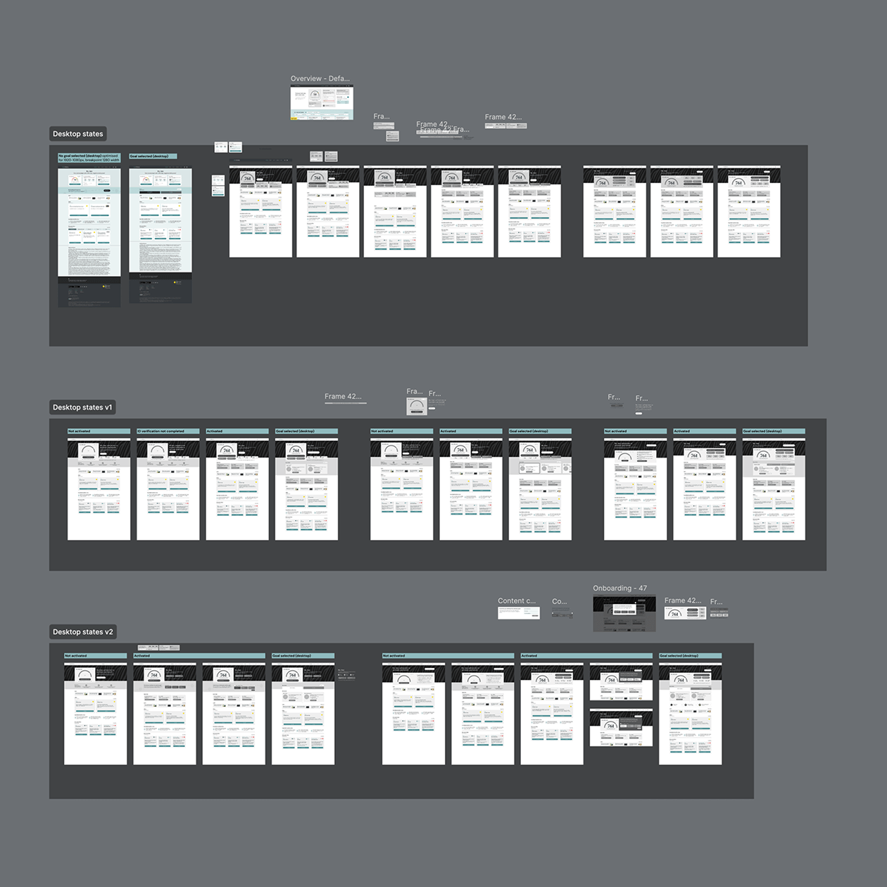
dev handoff
annotated specs, redlines & HTML/CSS snippets synced to Jira for pixel-perfect builds